Film Poster Research
We are now starting our ancillary tasks meaning that it is my job to research film posters and reviews so that within a month I will have enough information to create and design my own one for the 5 minute short film that me and my group created.
film posters are everywhere and its a companies purpose to try for audiences to see it in there everyday lives. You mainly see posters on social media, billboards, shopping centres and busses
This posters all above are non independent film posters. I realised that they are very different to each other. Hollywood film posters are very unique and individual all of them having a different trait that they can portray and show audiences a sneak-peak of what the film is about. Where as independent film posters I have realised are very dull and simple; its a fact that usually independent companies have a smaller budget than Hollywood but some of them are so terrible that I don't even believe that they link with the genre, storyline or representation of the film itself.
The three posters I have chosen are for many reasons. Firstly, none of the titles have different fonts all three are very normal, basic and don't stand out in any way shape or form. As well as that the colours are very simplistic due to the fact that there is no contrast or harsh , bright colours that would attract a niche audience let alone a mass audience. Thirdly the first two poster titles have no relation to the narrative, we can infer that the first poster "savages" indoors violence and blood and thats due to me as a viewer trying to infer what the film is actually about.
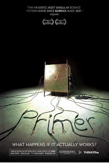

On the other hand, this poster is one of the most technical and creative ones I have seen so far. Instantly as an audience member I am intrigued to know what the 'wires' that are creating the title mean and whether or not that is a key aspect of the film. The contrast between the spotlight and harsh , ghostly black background makes me infer that the narrative is about a power cut or technical malfunction causing people pain and fear.
There are many film posters that are so similar that you could almost say that they are almost identical!! let me show you a few examples:
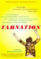

There are many film posters that are so similar that you could almost say that they are almost identical!! let me show you a few examples:


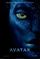
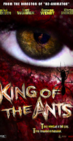
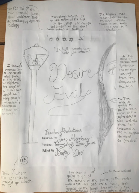
I also created some sketches that could possibly portray our film!!
They was very fun to create however was very time consuming and I am not very good with art! so it was a challenge but I tried my best, they may not be masterpieces but I think they are very creative.
Codes and conventions of horror posters
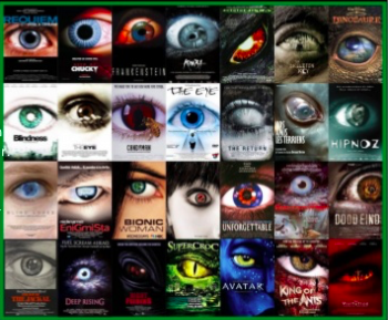
The most common code and convention of a horror film is an extreme close up of the eye. There is usually an naturalistic and eerie effect to the eye to draw in mass audiences.Furthermore the widened eye is an expression of fear and being shocked making audiences see that it relates to them and creates enigma, but it can also change the effectiveness due to it being so common. The disturbing nature of the image infact changes the aspect of the film as usually the image of the eye is actually never shown in the film itself. As well as the due to the edited colouring and naturalistic shadowing the aspect of the eye of the poster is lost.
Taglines
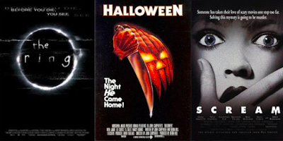

-Directly above the title intriguing audiences to find out the reason for death.
-Gives the audience an insight of the genre of the film and instantly targeting only a certain audience.
-The font is very simplistic and small making the tagline subtle

-This tagline is bigger and more bold , continually it also is placed on the side of the poster with is very different to many posters.
-Even tho its importance the subtle tagline works better as it doesn't take away the power of the title, making it easier for audiences to understand the concept of the film.
- The tagline is linked to the theme of the film
- Simple colouring of the text to not over power the title.
The tagline that I have chosen to use is very powerful and individual.
"In hell nobody can hear you scream"
Target audience
So how do all of these posters appeal to our target audience? This is a an I portent issue to discuss because if our target audience is not attracted the film will not get scene and profits would be negative(not for us-for the Hollywood big six). All the posters I have evaluated are very dark and horror related - however this is what is going to attract audiences of our films genre.A tricky mistake is overcomplicating the whole poster as sometimes it can ruin the effect of the film itself. A significant prop or character on the poster allows the audiences to create a relationship with the narrative.

CREATING my poster!
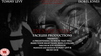
At first this is how I wanted my poster to be I wanted to show the contrast of colours between black and white and bright lighting , to show the audience a clue to the storyline of the film.However I realised that it created a childish atmosphere as I felt that it was to cliche and ruined the concept of the poster itself.
The poster then changed into a dark and creepy poster that was a lot more powerful but something was still missing!! It didn't stand out, the colours were all very similar and to me it just didn't have the wow factor!I realised from the very beginning however hat I wanted to keep the same font as what I had in the beginning as I believe it worked perfect with the effect of what I was trying to show.
So I then decided to try and improve it by adding a un-naturalistic and paranormal effect of static to imply to audiences that the theme of exorcism is part of the narrative. As well as that I brightened and defined our production logo to stand out to our target audience as before it was grey and didn't create any effect whatsoever, however now it symbolises our genre and both what our production logo stands for.
MY FINAL POSTER
Reviews
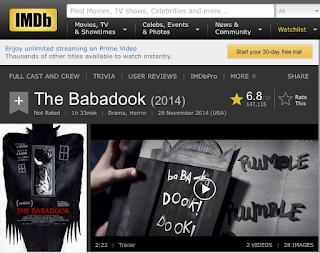
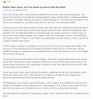
I have screenshotted 2 different reviews from IMDB and Rottentomatos that review over the film 'The Babadook' which was broadcasted to cinemas in 2014.
Rotten Tomatoes is a website that that rates the film as a whole from the public eye. This is an incredible way to review a film as the film can get an overall response from all different types of audiences. Different races,genders,sexuality,ages and ethnicities.
Whereas imdb are separate reviews where each critic or opinion is individually shown on the website and are usually options on the rise-en-scene, characters, narrative, specific actors etc.As well as that this website intact has the trailer beside the review to be able to show audiences some of the story unfold and have a wider view on the actual review.
planning
without having an overall understanding of reviews I thought I would plan and create what my review could possibly look like, this is so that when I do create my review I have a better overview where I can identify the positive aspects of what I write.
My own physical research on magazines
Pros
- Reference to the actors names
- Short synopsis of the narrative- trying to appeal audiences without gibing away too much of the storyline.
- Included everything essential even though its short.
Cons
- The picture is very small and doesn't create any affect.
- The whole review could be too simplistic without star rating, coloured text etc.
- The set of the review is strange because of the boring and simplistic font.
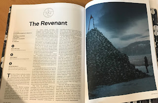
Pros
- Linking to deeper context which the film has added/involved giving the film a purpose and intention.
- Iconic picture on the right side of the page, drawing in audiences, interesting and bold.
- Quotes included to add affect of the text and film.
Cons
- Boring text colouring not being able to engage and attract creative people.
- The white background eliminates the effect of the dark photo.
- The positioning of the text is strange and not aesthetically pleasing.
What should be included a film review?
1.To imbed different parts of your review within different paragraphs.
2.The story behind the star rating and how it was chosen.
3.Create the feeling of the film so that the audience are already involved in the atmosphere.
4.Quotes that are spoken in the film.
5.An aesthetically pleasing photo that attract the wright audience to the wright genre - leading them to read the whole review.
6.Review everything about the movie itself, the director, actors,music etc.
7. If so link back to past history , creating subtexts etc.
The next step is writing my own review!!!
I researched some videos on how to successfully write a film review and this is what I found.
The next step is writing my own review!!!
I researched some videos on how to successfully write a film review and this is what I found.
From this Video I learnt a lot of ways to write a review they're were a certain set of rules that should be taken in consideration.
FIRSTLY there should always be a structure that takes the reader from the beginning to the middle to the end.
SECONDLY even though the review should explain and evaluate the movie there should not be a spoiler alert.
THIRDLY you should always know what your talking about with backed up facts etc
FOURTHLY there needs to be a consistent theme or atmosphere when a person is reading the review to engage with the film itself.
FIFTHLY the most important part is that the grammar of the review has to be absolutely perfect.
MY REVIEW
When researching I realised that the most effective for me was the short columned reviews that travel the reader into a journey from the beginning to the end. In my opinion the long and overpowering reviews tell too much of the story and already create the reader to have a certain perspective before watching the film itself. It was very difficult for me to write the review due to the rules that all critics should stick by. This is my review and I hope that you can understand

I then asked two of my peers there opinion on my review and asked what they enjoyed and what I could improve on.
MY REVIEW
When researching I realised that the most effective for me was the short columned reviews that travel the reader into a journey from the beginning to the end. In my opinion the long and overpowering reviews tell too much of the story and already create the reader to have a certain perspective before watching the film itself. It was very difficult for me to write the review due to the rules that all critics should stick by. This is my review and I hope that you can understand

I then asked two of my peers there opinion on my review and asked what they enjoyed and what I could improve on.






No comments:
Post a Comment